Re-kerning Baskerville Original
The fonts cut by John Handy for John Baskerville’s press in the 18th century are surely among the greatest book faces ever crafted, but modern digital renditions tends to do them a disservice. This is not due a lack of such interpretations: Monotype and its myriad subsidiaries offer Baskerville Classico, Baskerville LT, New Baskerville ITC, and Baskerville URW (to name just a few), but each is deficient on one or more metrics. Many are underweight. Many lack essential features. A few are coded so poorly that they’re essentially unable to properly set a page of text.
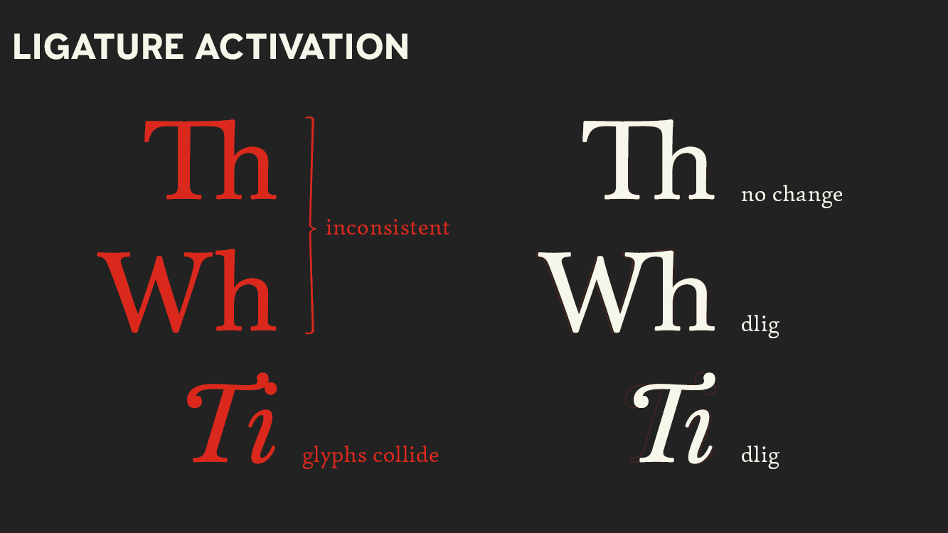
Easily the best digital ‘Baskerville’ available today is Storm Type foundry’s Baskerville Original, which is appropriately weighted, rich in features, and competently encoded. Baskerville Original has one notable weakness: its kerning (i.e., adjustments to letter spacing assigned to specific character pairs). Good kerning is essential to good typography, but a complete kerning table is a massive undertaking on the part of the type designer that sometimes is left partially incomplete for the sake of expediency. Fortunately, kerning is something that can — with effort — be fixed in the layout environment without changing the font files themselves. The most efficient way of doing this (in InDesign) is with a feature called grep styling that automatically applies character styles to text strings that match a given regular expression.
In odd moments across a year starting in August 2020, I set out to devise a comprehensive (and hopefully robust) set of grep styles that would give Baskerville Original kerning worthy of all its many other nearly flawless aspects.


The test case I used for working with Baskerville was a longtime favorite novel, Jonathan Strange & Mr Norrell. Images of those test layouts are in a separate post here.