The SEcret of Chimneys
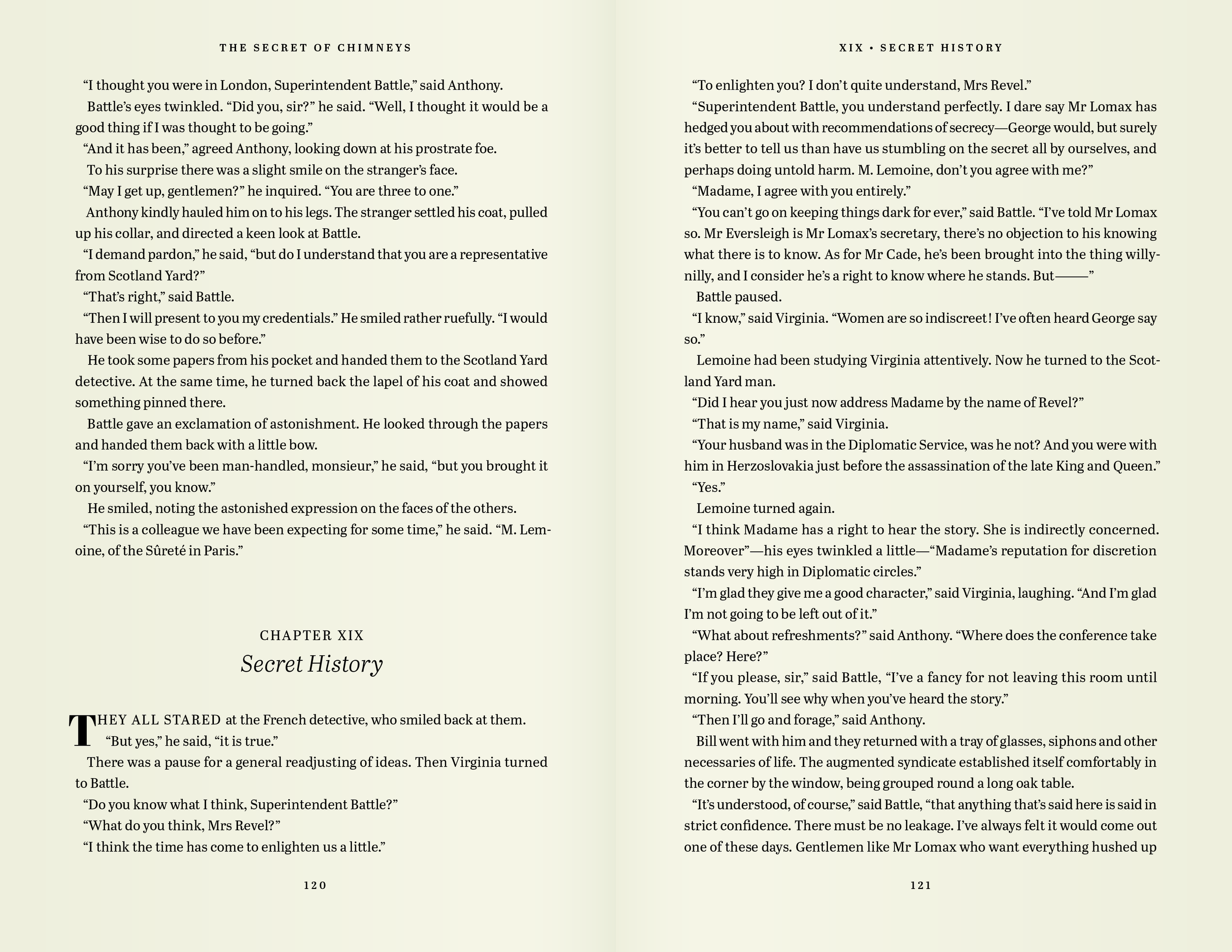
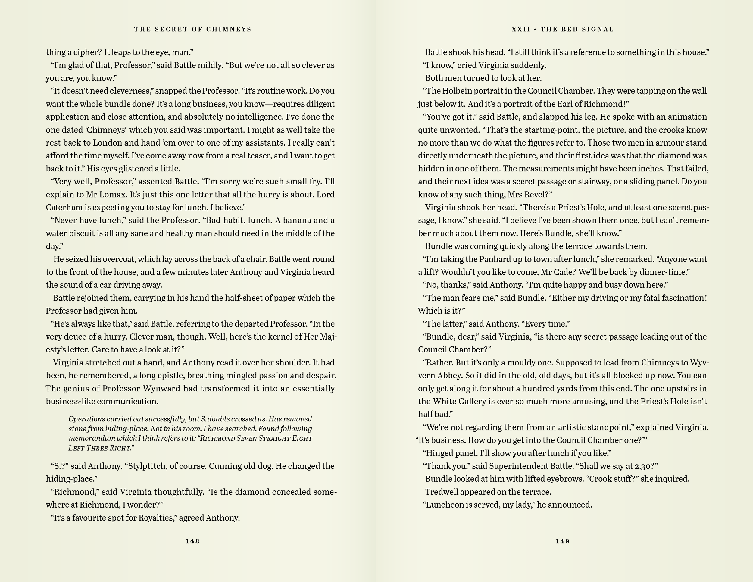
I’m a longtime admirer of type designer Veronika Burian, and I wanted to better know Abril, a font she created with her TypeTogether co-founder, José Scaglione. Something about its no-nonsense newspaper-readiness made me think it would be a great fit for an Agatha Christie novel. Unfortunately, the Queen of Crime’s canon is only just beginning to cycle into the public domain, so only her earliest works have become available. I took a swing at The Secret of Chimneys. The novel turned out to be hackneyed in every way and racist beyond belief. Abril, on the other hand, was a pleasure to work with.
In the below sample spreads, some paragraphs are tinted blue. This is just a temporary visual indicator of paragraphs that were given extra tightening as I was searching for the best possible page breaks and would not be left as such were I ever to print this. Which I won’t. Because it’s a terrible, terrible book.
Book interior. Text by Agatha Christie. Set in Abril by José Scaglione & Veronika Burian.


