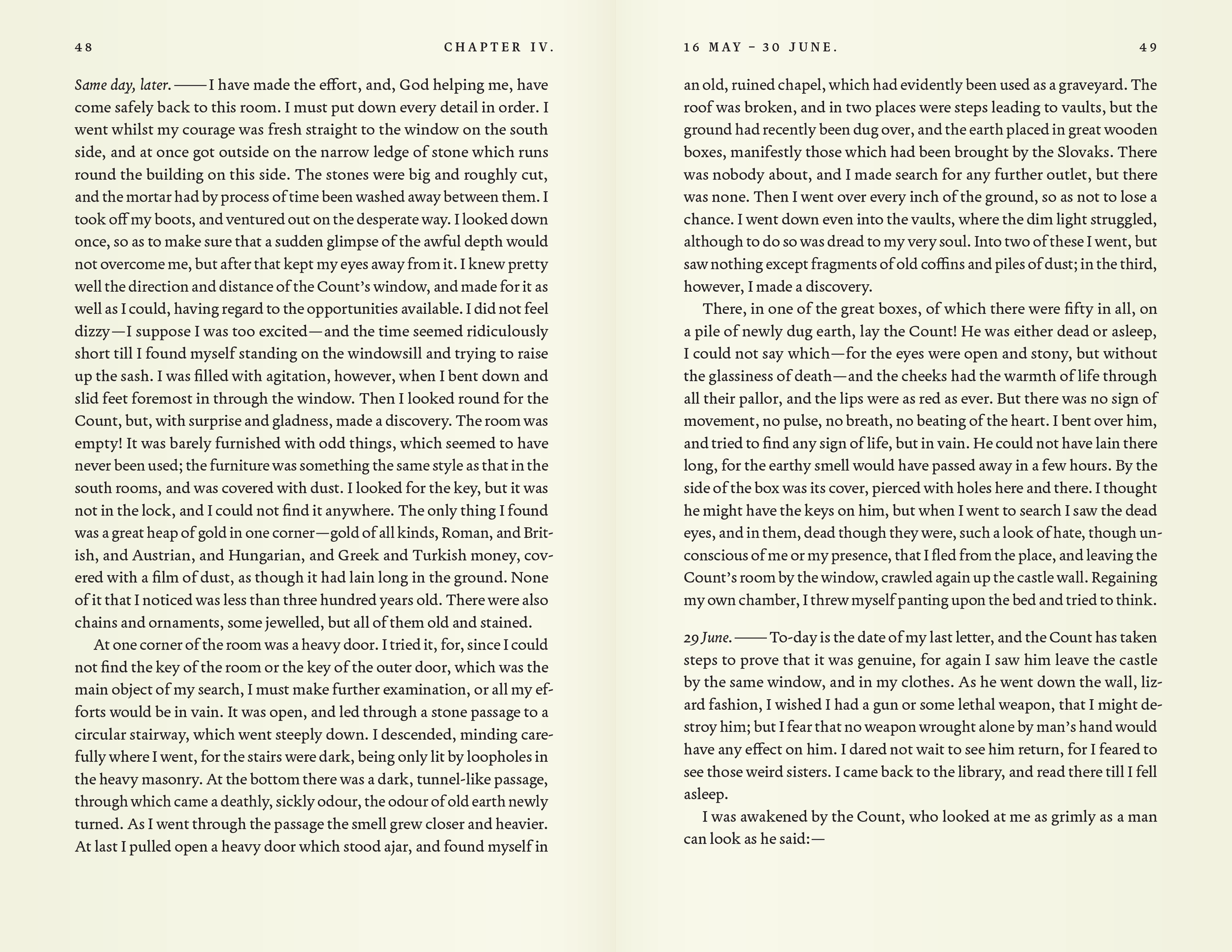
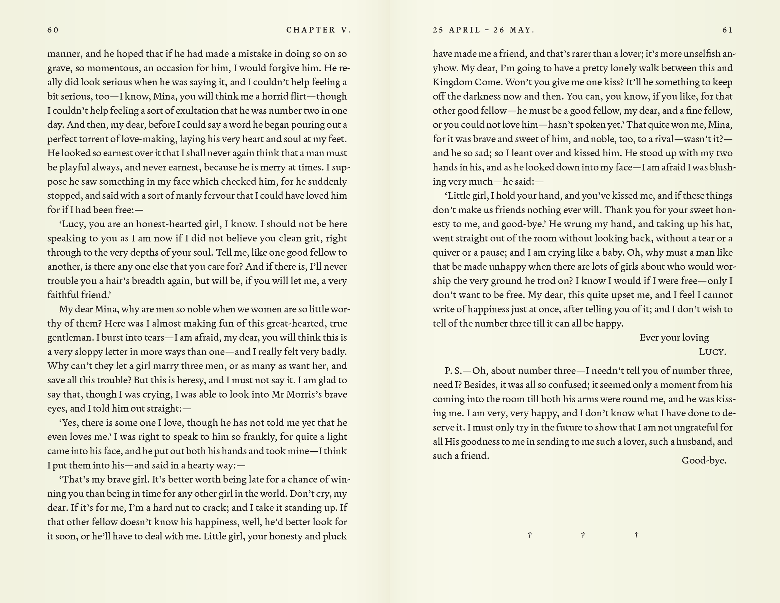
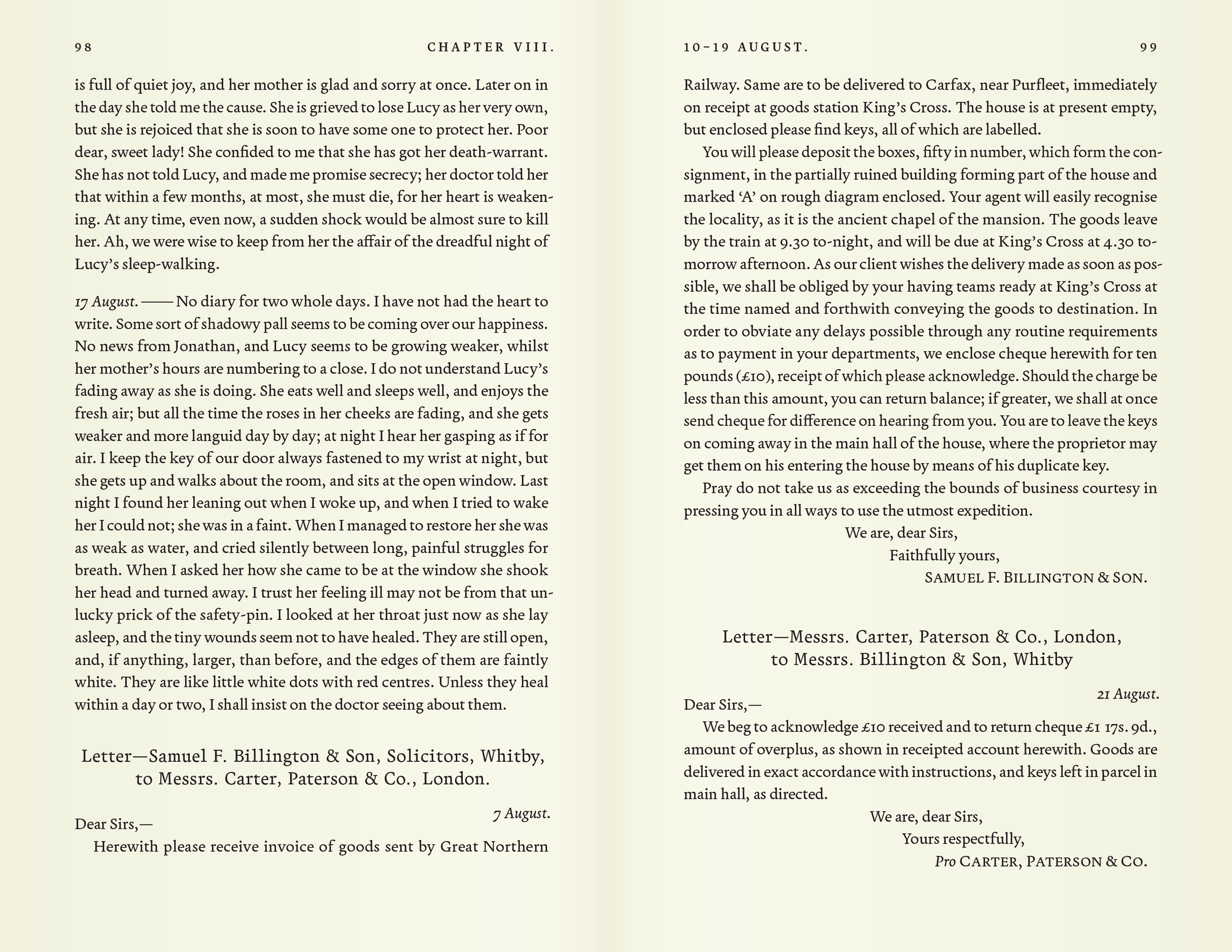
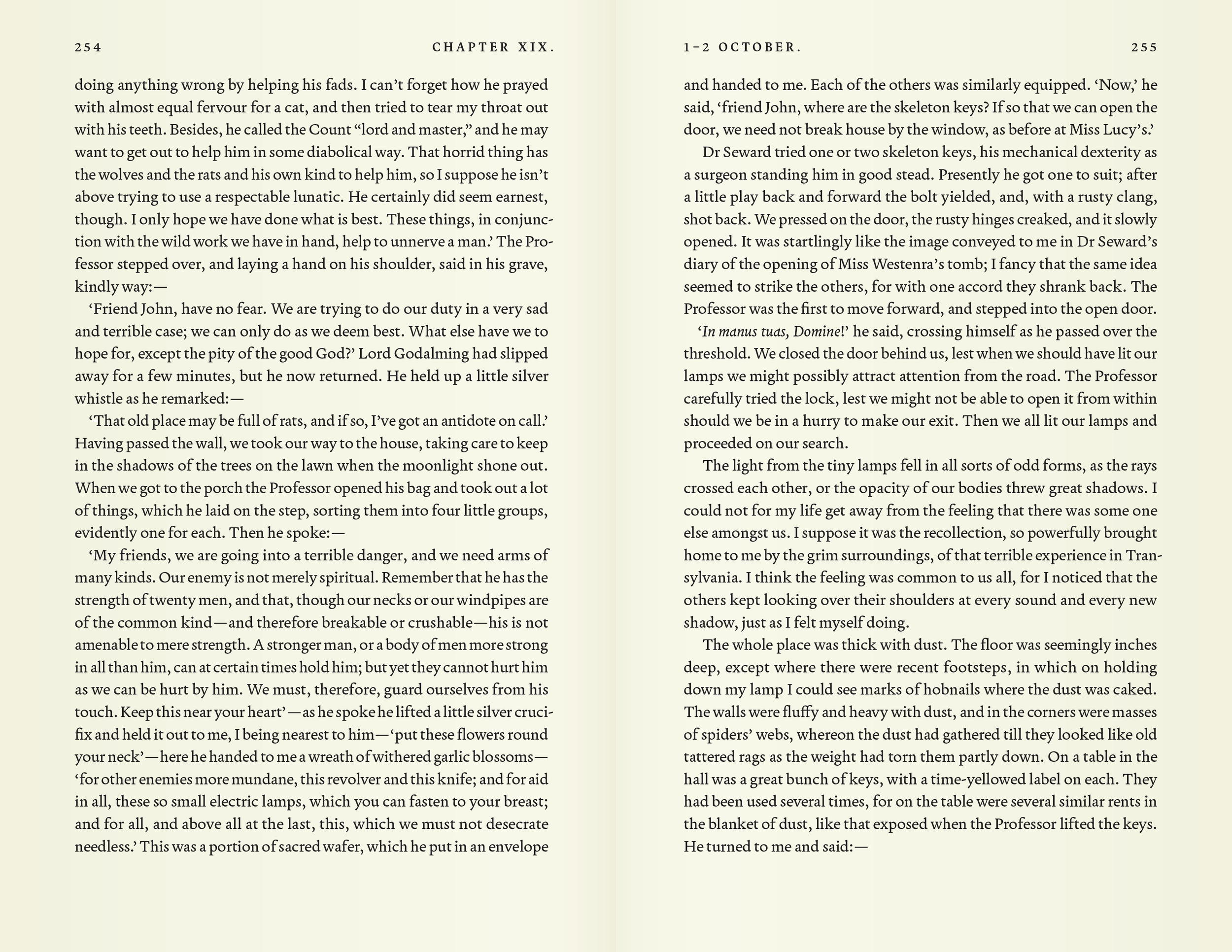
Dracula
With certain novels, you can practically taste the author’s unrealized design ambitions, and there may be no more obvious example than Dracula. The famed horror novel addresses (to varying degrees of success) gender roles, class roles, and England’s position as a global hub, but it is also an ode to modern communication and a celebration of the typewriter and the telegraph. The found-document structure includes telegrams, newspaper clippings, journal entries, and letters—a handful of which are explicitly labeled by hand, thereby implying that the rest are mechanically produced. Sadly, the celebration of progress in the story is wholly absent in the appearance of the page in both the U.K. and U.S. first editions—and virtually all editions that have come since.
My vision for this classic novel hinges on two design aspects. The first and most important is the use of Greg Gazdowicz’s Terza, which cleverly merges warm Venetian forms with cool mechanical rigor. Three subfamilies explore different approaches to width and rhythm, and all find use here. Terza Reader has naturally proportioned glyphs and is used for the body text. Terza Editor is a rigid monospace, with all glyphs of equal width, and is used for telegrams. Terza Author is a hybrid and is used for section titles, thereby seasoning as many pages as possible with a suggestion of the mechanical.
The second design aspect is an unusual approach to line spacing. Most book designs (particularly those books without graphics) adhere strictly to a baseline grid, and make a space between paragraphs (when they are spaced) exactly one standard line. This works well when such spaces are rare or always accompanied by a header, but the full-line space tends to look awkwardly large when no header is present. Some book designers allow half-line spaces when necessary. My design for Dracula uses a ⅓-line module and reaps some interesting benefits as a result.
The original nineteenth-century editions employ quotation marks around every paragraph in letters, telegraphs, and newsclippings (every document format except for entries), seemingly as an admission that the formatting failed to emulate those documents convincingly. I sought to finally unite the text with the formatting it demands. Compare this to the Dover Thrift Edition (2000), which is faithful to the first edition (1897), and the Norton Critical Edition (1997), which dispenses with much of the original punctuation, albeit inconsistently (the absence of the dash after ‘17 September’ is anomalous within the edition).
A principle design failing of the original 1897 and 1899 printings was the mistaken implication that the chapters were named as well as numbered. Most chapters included multiple document excerpts, but the publishers mistakenly appropriated the name of the first document in each chapter and an umbrella name for the chapter, when only a number is appropriate. Some recent editions, like the Dover Thrift edition double down on this error by combining the chapter number and first document title onto a single line. Others, like the Norton Critical Edition retain a merely ambiguous arrangement in the chapter titles but correct the running heads. My design cleanly separates the chapter number from the first document title with a generous vertical space.