Moby Dick
An iconic work like Moby Dick, released in myriad editions, inevitably spawns no shortage of indifferent designs—some due to unyielding series guidelines, others due to simple apathy. More interesting than indifferent designs are the inappropriate designs that result from creators’ focusing on a novel’s place in the literary pantheon rather than responding to the text itself.
This design for Melville’s magnum opus began as a reaction against the Easton Press’s 1977 “100 Greatest Books Ever Written Collector’s Edition”, which is as cringeworthy as its names suggests. Its design is dominated by the oversized drop caps that start most chapters (but are skipped when the chapter starts with stage directions, or the chapter starts with an epigraph, or the chapter is shorter than the oversized letter—there is little coherence). I approached my version (still a work‐in‐progress) with the belief that the design for this oddly structured novel should be so unassuming as to be appropriate for a charter or legal document.
One-color book interior. Set in Walbaum 2010 by František Štorm ¶ Photos by Emily Lin.


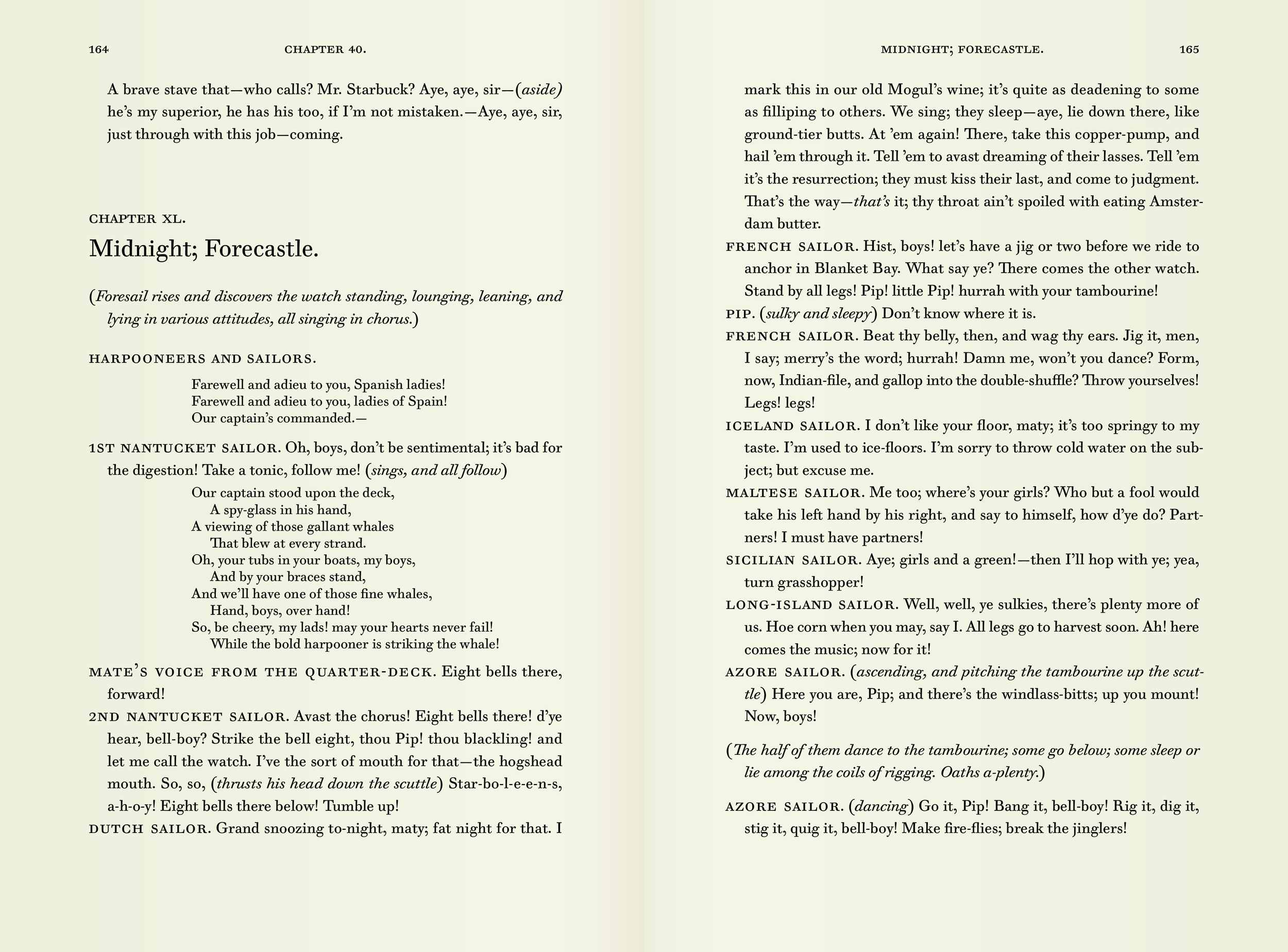


It’s worth noting that the Moby Dick’s chapter titles are often a little ambiguous. Melville was making amendments right up to press (and no doubt expected that he would be able to make further corrections in the second printing, which poor sales ultimately prevented). The result was many discrepancies between chapter heads and corresponding entries in the table of contents. Add to that the number of chapters beginning with an ambiguously formatted ‘stage direction’, and the result is significant inconsistency across the novel.


Chapter 121 exemplifies the typical ordering of place and time (and punctuation separating them) in chapter titles.
Chapter 122 is the shortest chapter in the novel—so short that the 100 Greatest Books Ever Written Collector’s Edition is forced to abandon its overwrought five-line-tall drop cap.
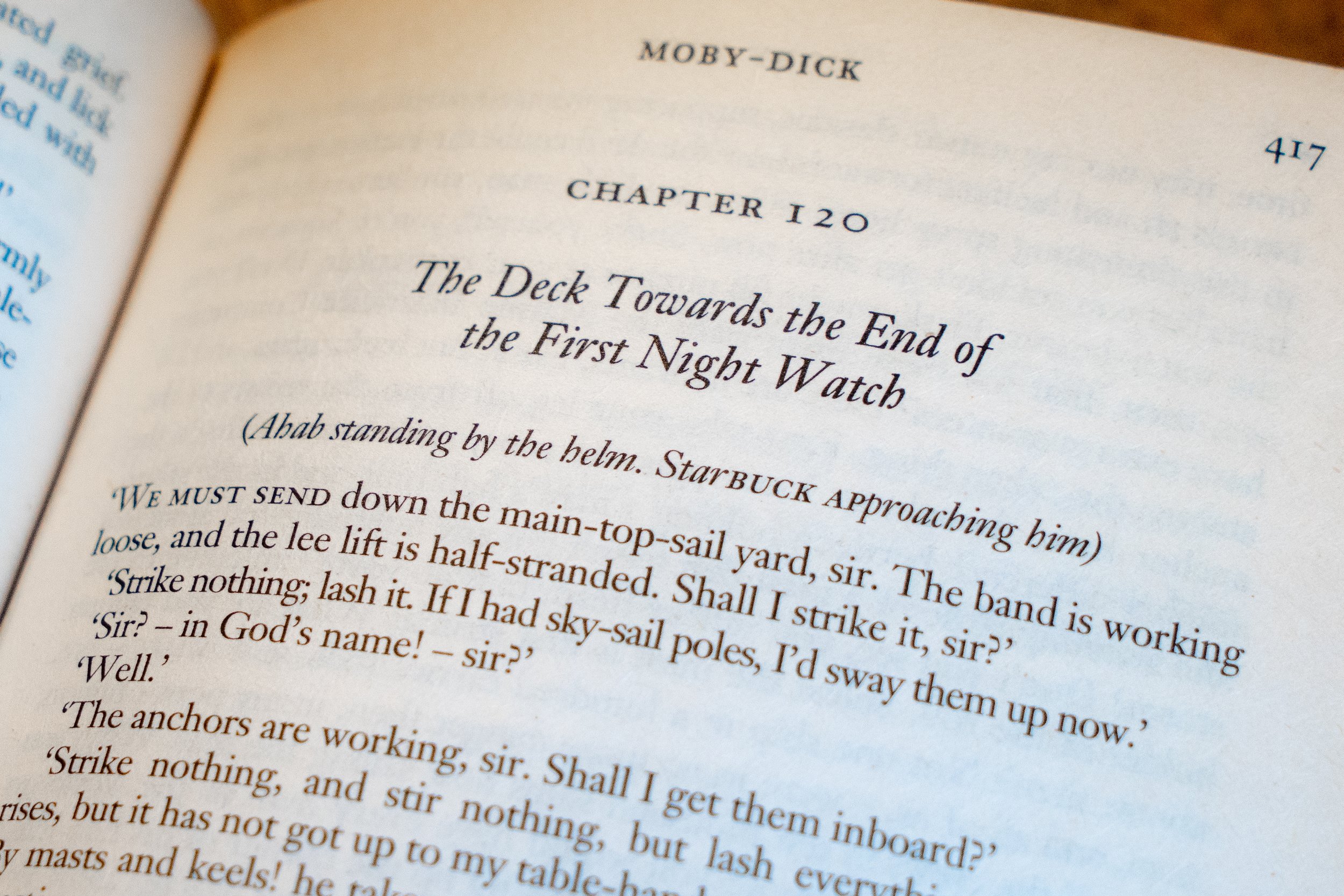

The title of chapter 120 is unusual in its (probably accidental) lack of punctuation between place and time. It seems as if someone at the Easton Press sensed some amendment was needed, but the heirarchy they introduce breaks awkwardly. The editors of the Wordsworth Classics edition (1993), preserve the original muddle (and then introduce some highly irregular capitalization in ‘Starbuck approaching’).