Baskerville Original test
František Štorm’s Baskerville Original is, simply put, one of the best text faces of the digital era. It is well drawn, beautifully weighted, and—unusually—features comprehensive small capital and numeral forms. It has a few rough spots, the most significant of which is sporadic kerning issues.
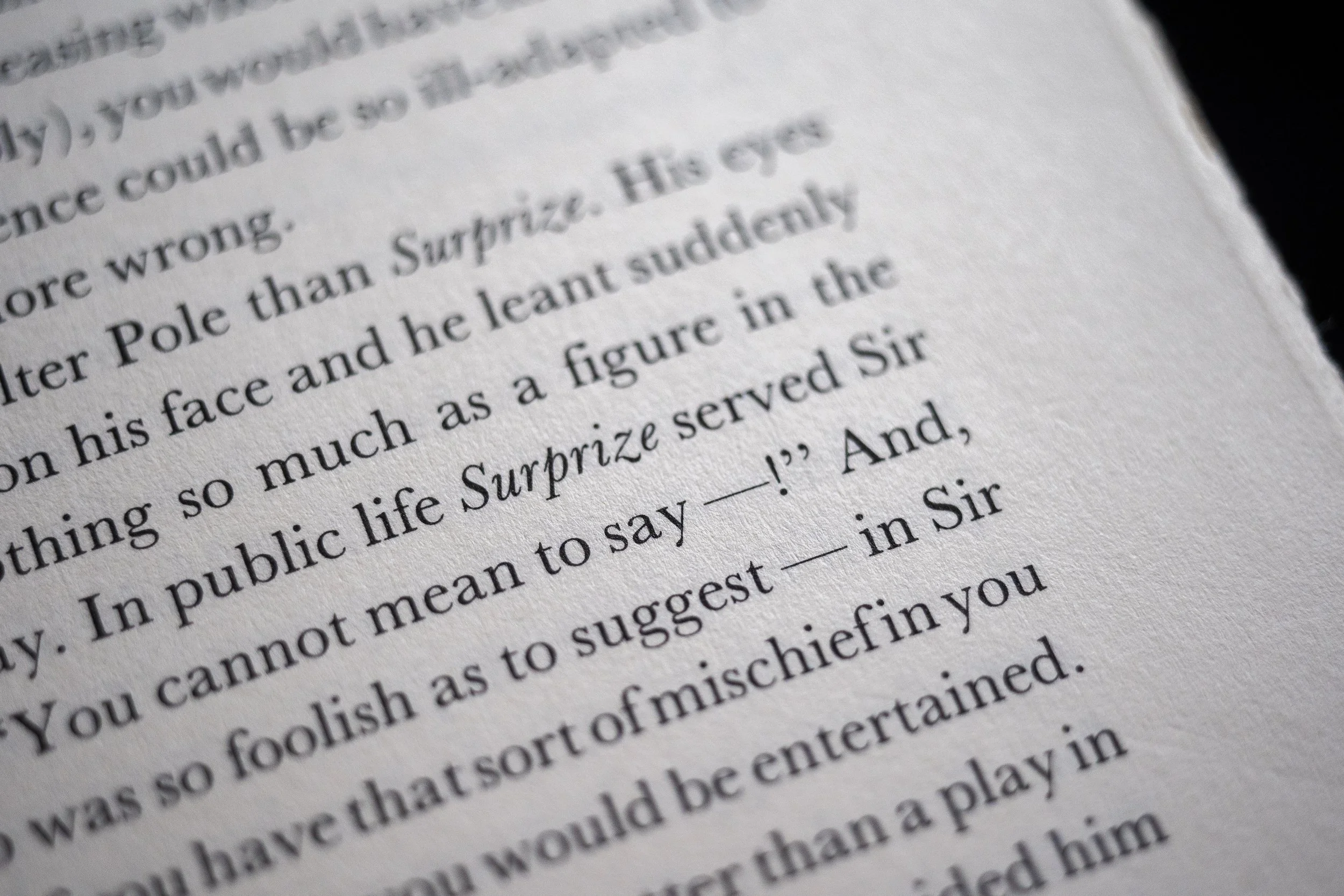
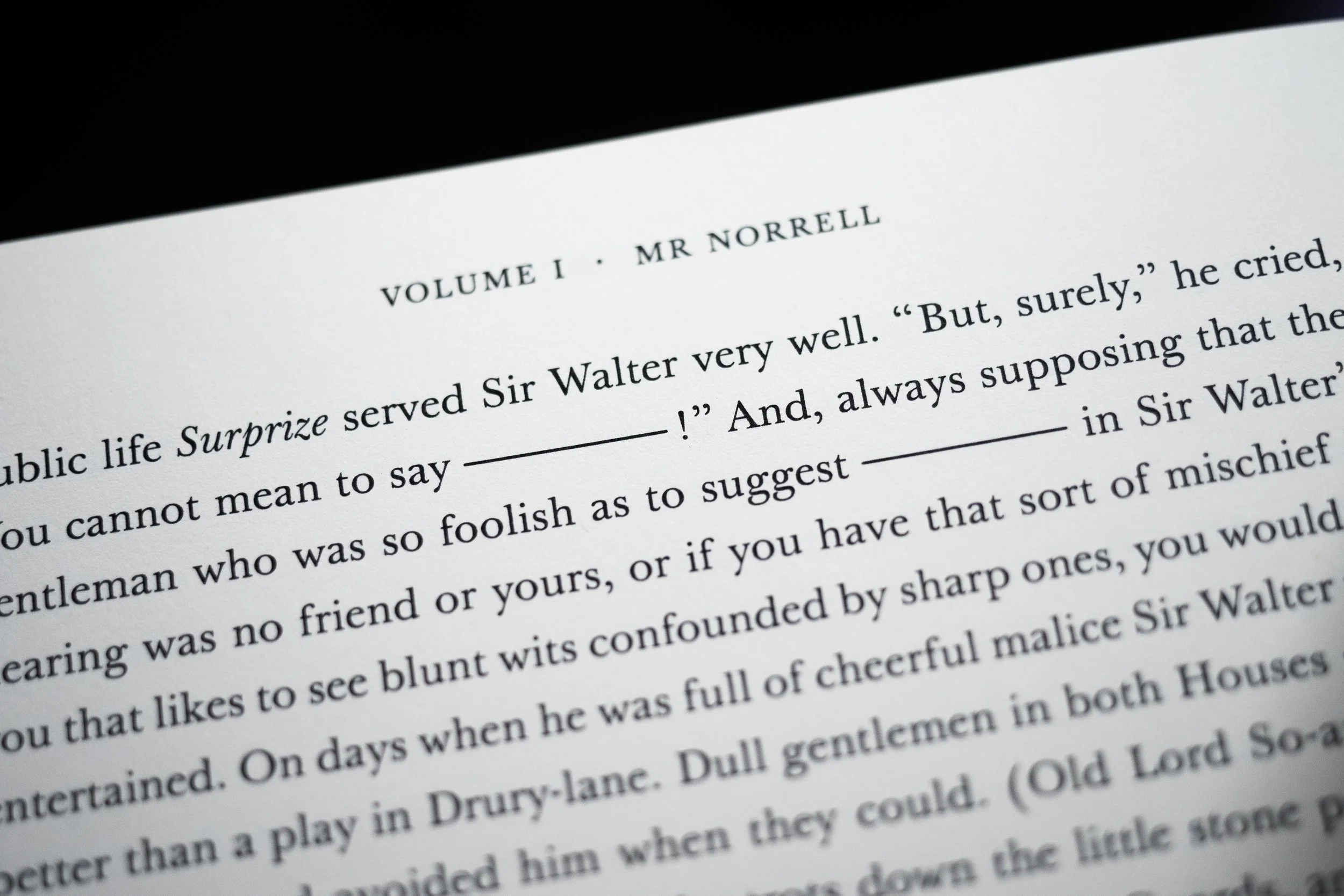
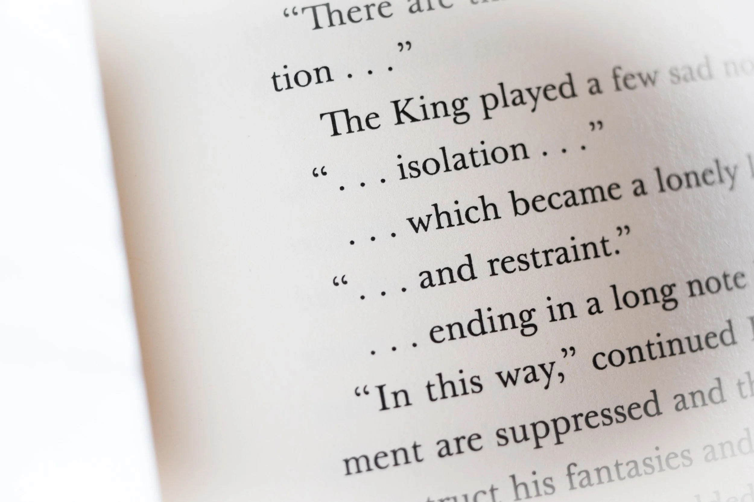
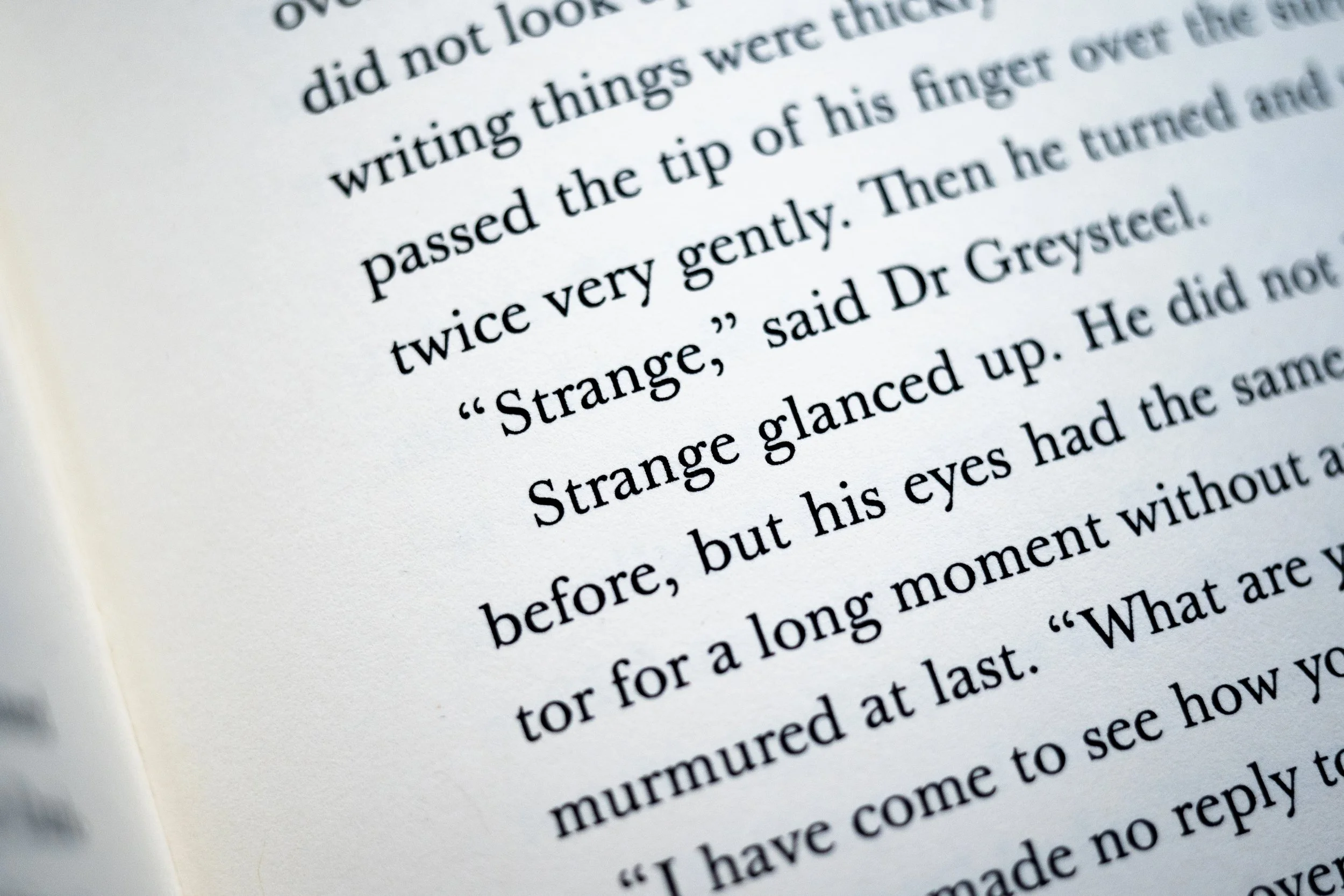
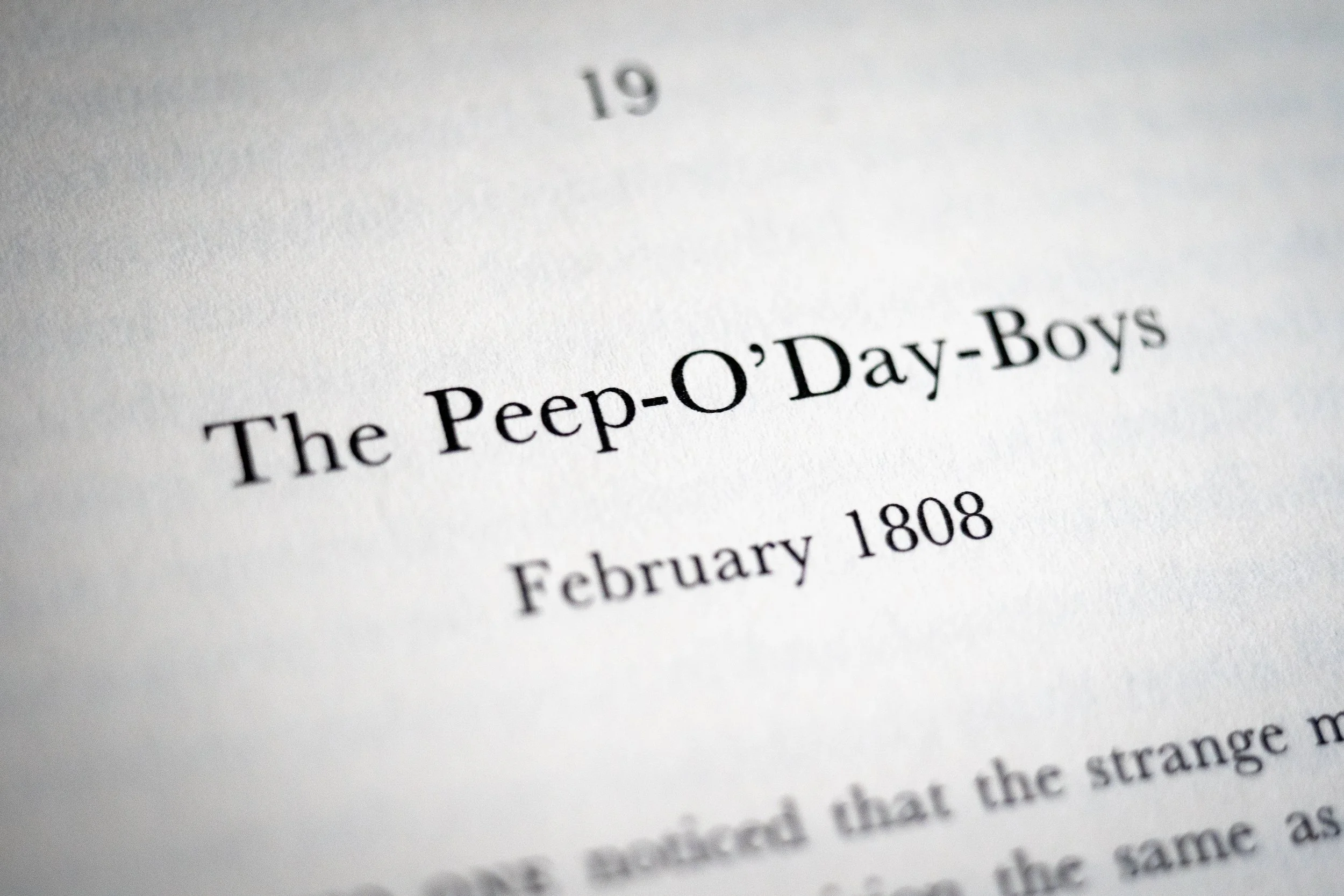
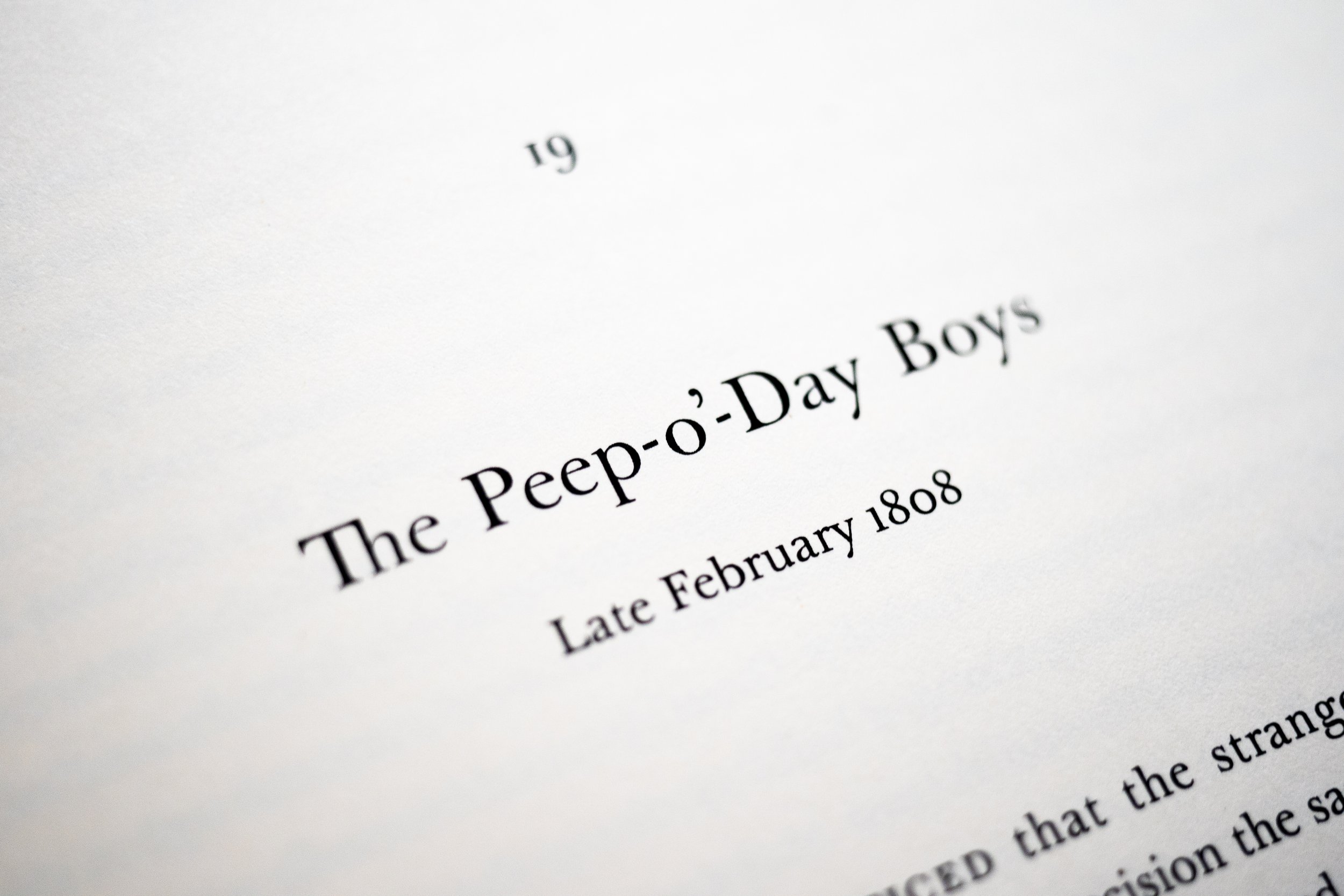
In 2020, I decided to develop a set of grep protocols that would effectively patch Baskerville Original’s kerning table within the InDesign environment (i.e., without editing the font files themselves). As someone with neither formal kerning experience nor a deadline, I figured that the best way to approach this challenge was to immerse myself in Baskerville as a reader. To do that I re-set one of my favorite novels ever printed in a Baskerville face—Jonathan Strange & Mr Norrel. At some 337 000 words, it was an absurd undertaking, but during the social distancing of 2020, a bit of absurdity was welcome.
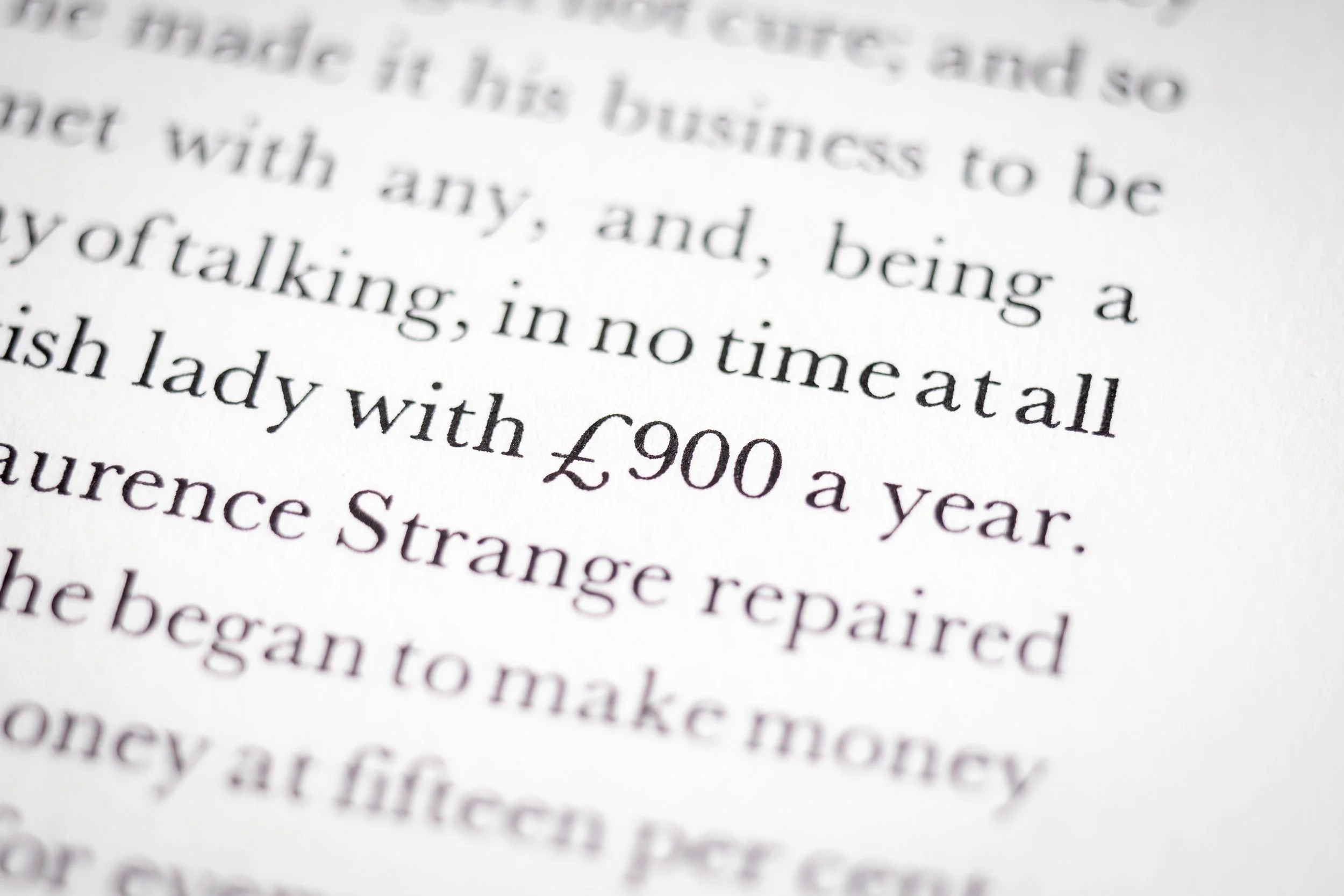
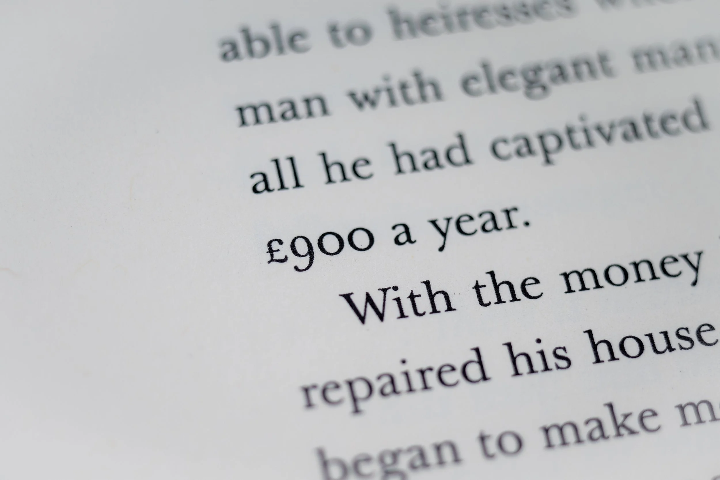
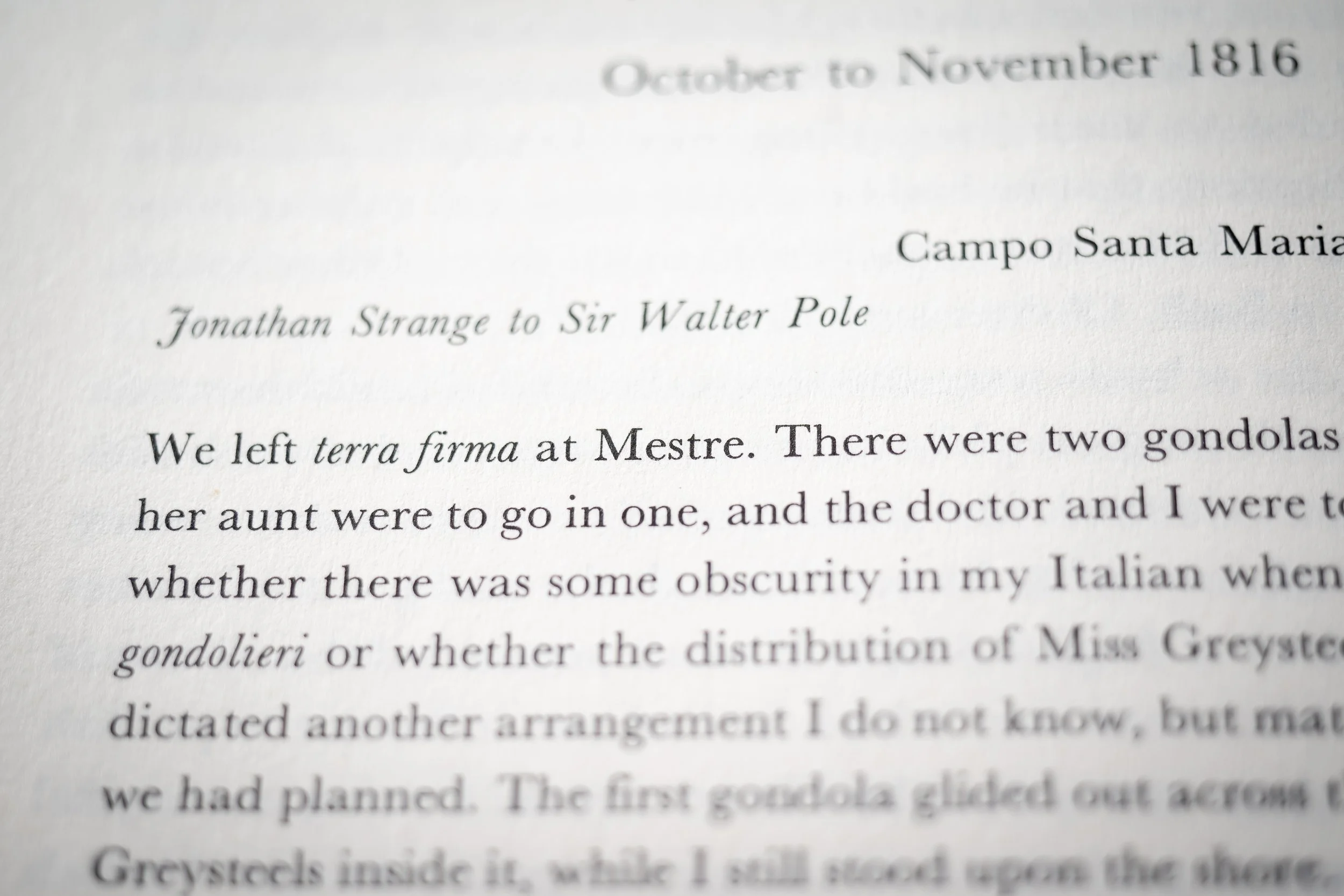
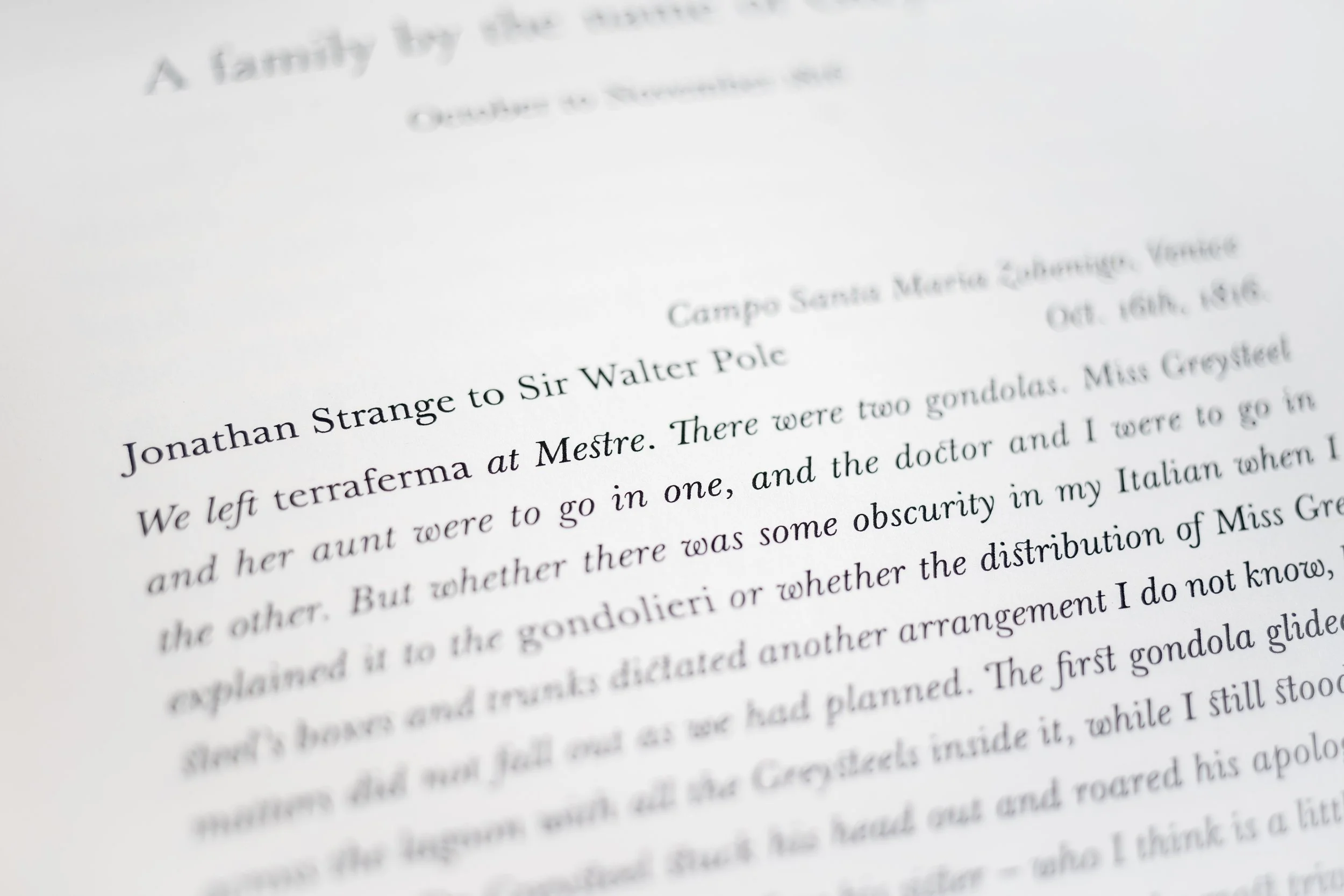
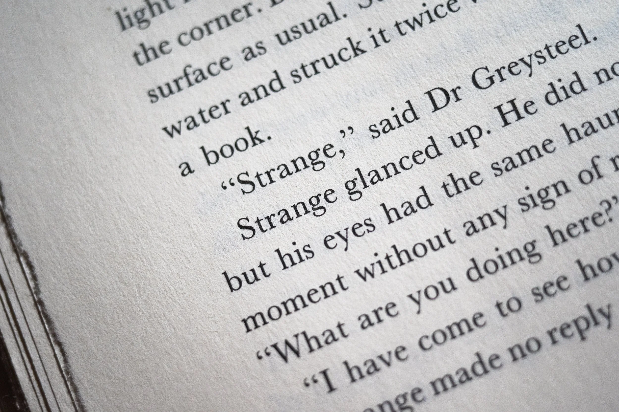
Below are images comparing details from the original, authorized printing with my basement creation. Bloomsbury’s version, apparently set in a clone of Baskerville URW (and on slightly nicer paper), is first in each pairing.
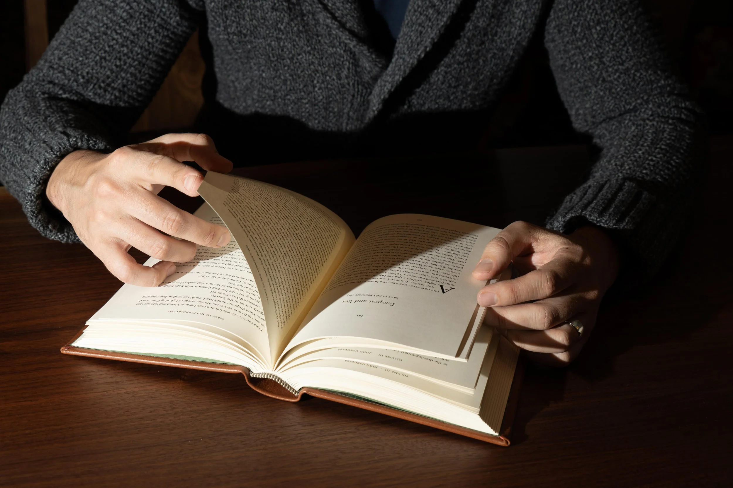
Single-color book interior. Design and typesetting by H. Set in Baskerville Original by František Štorm. Photos by Emily Lin.