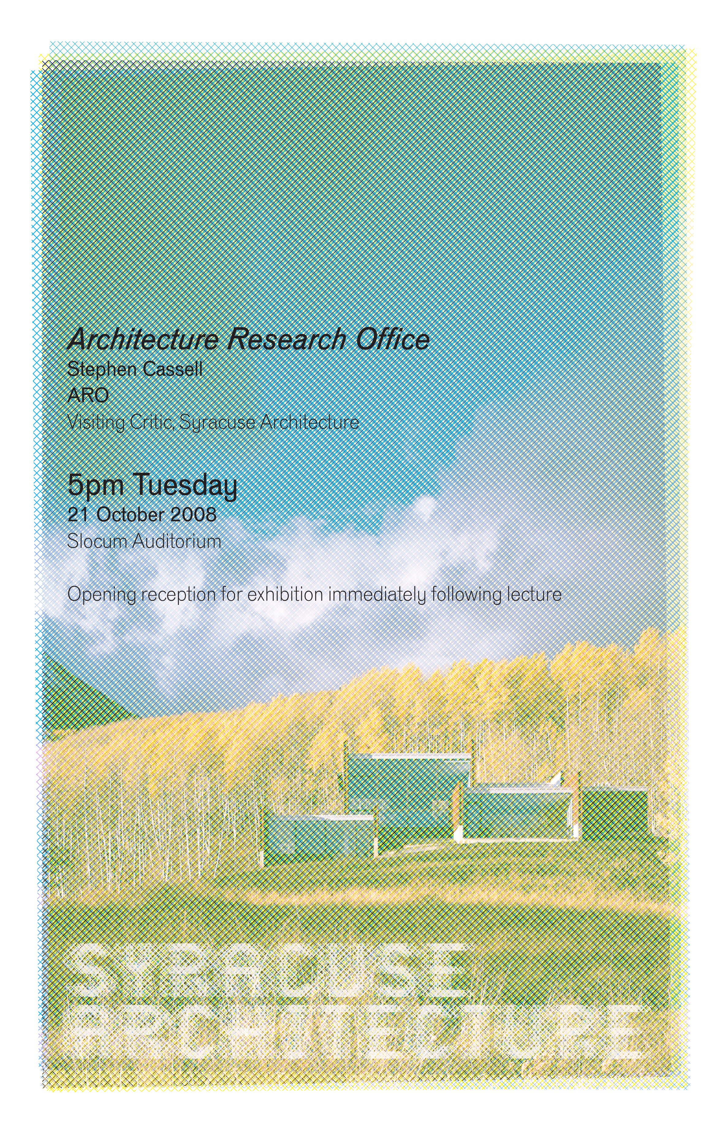
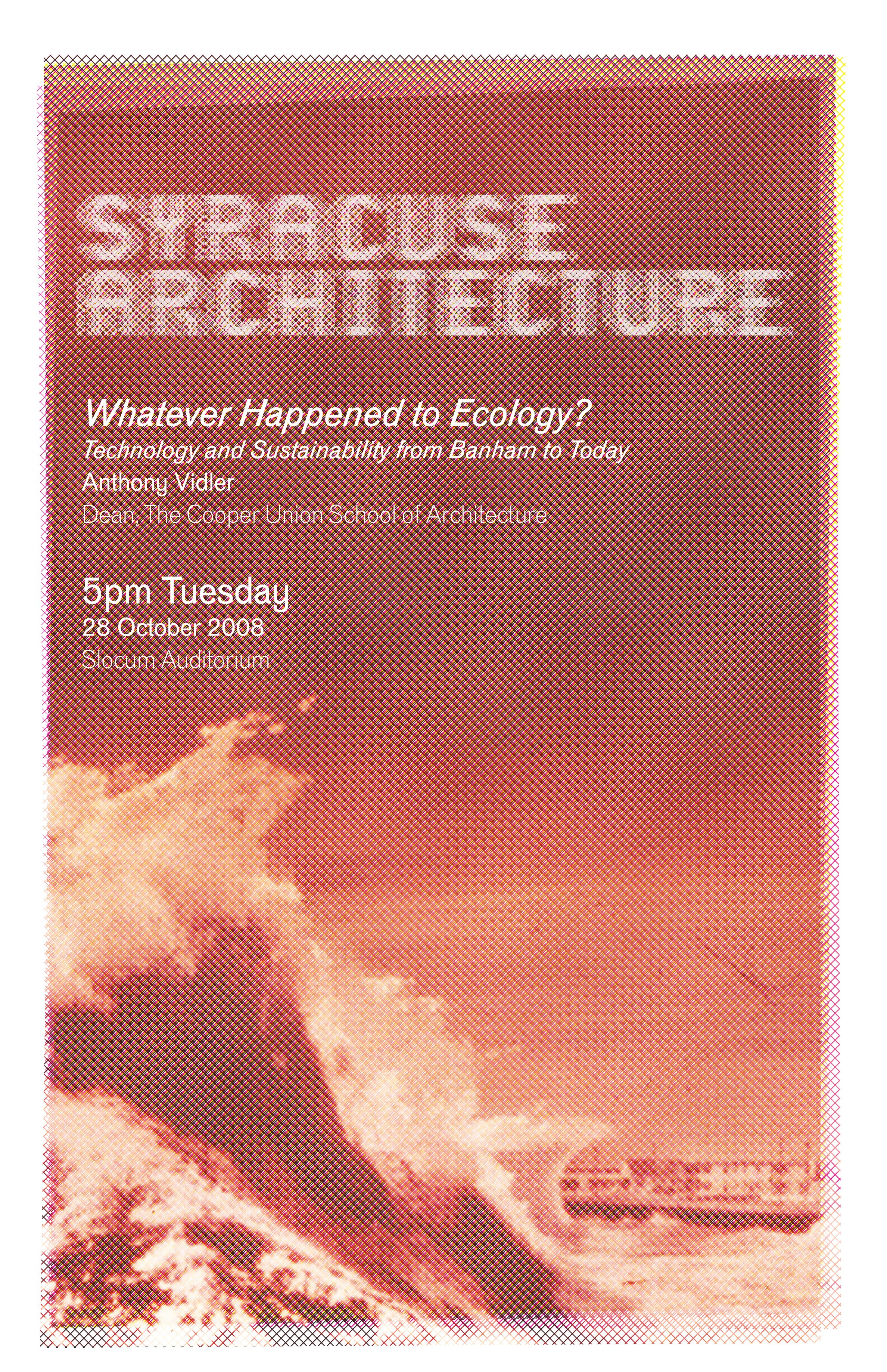
Event posters
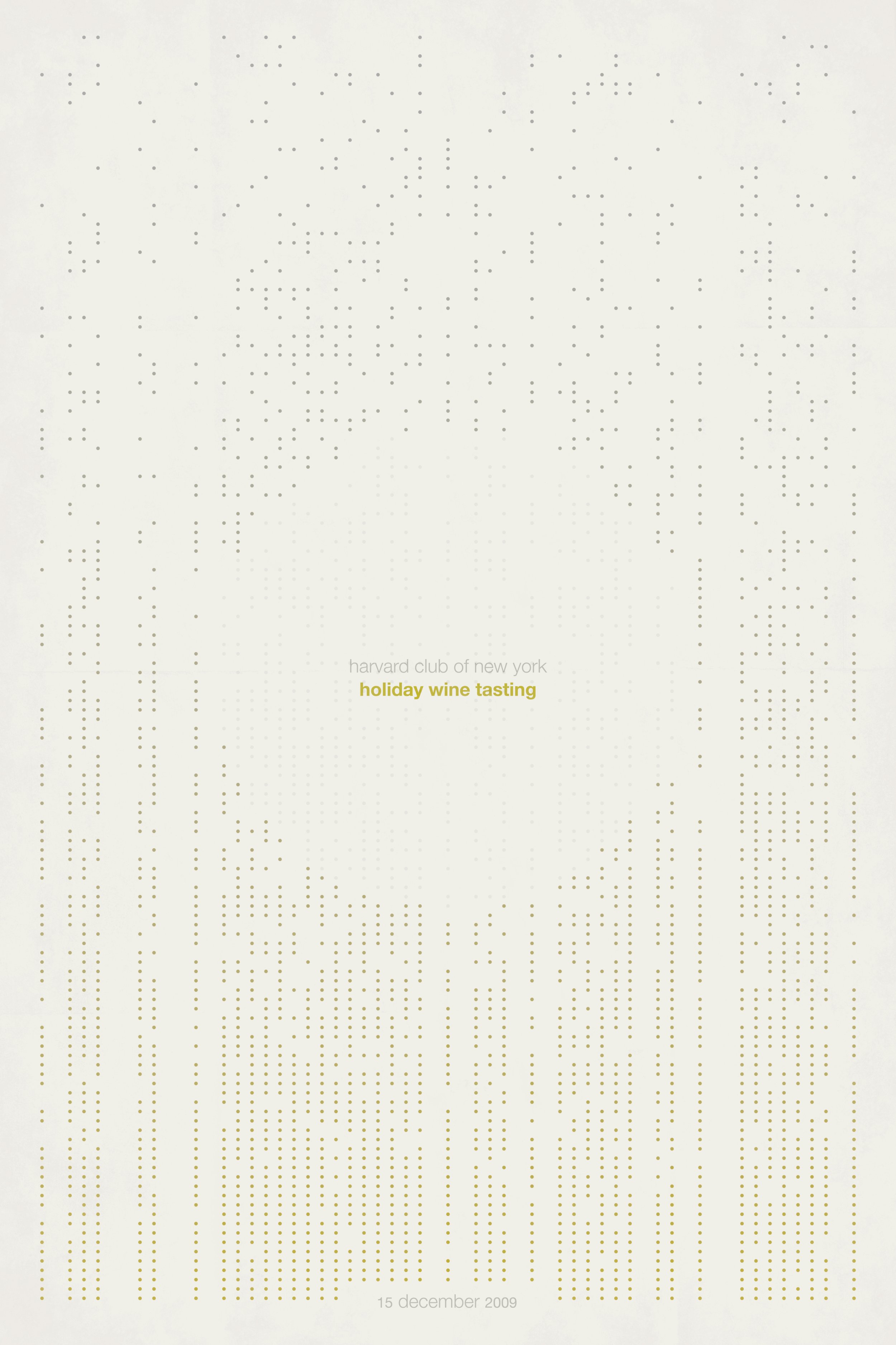
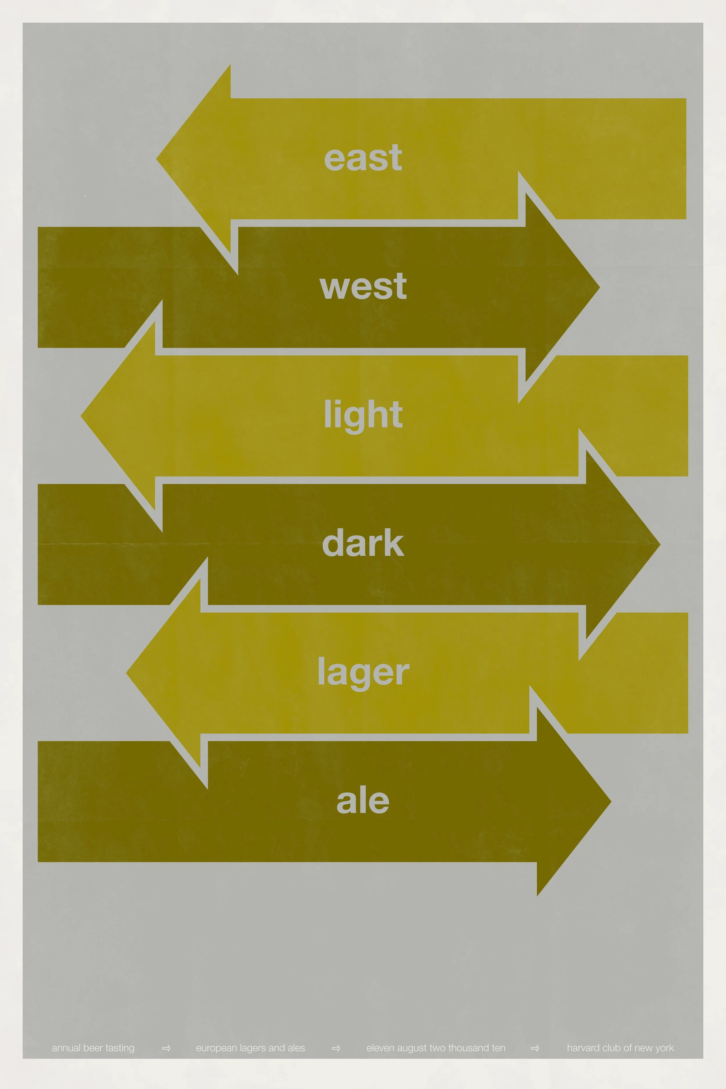
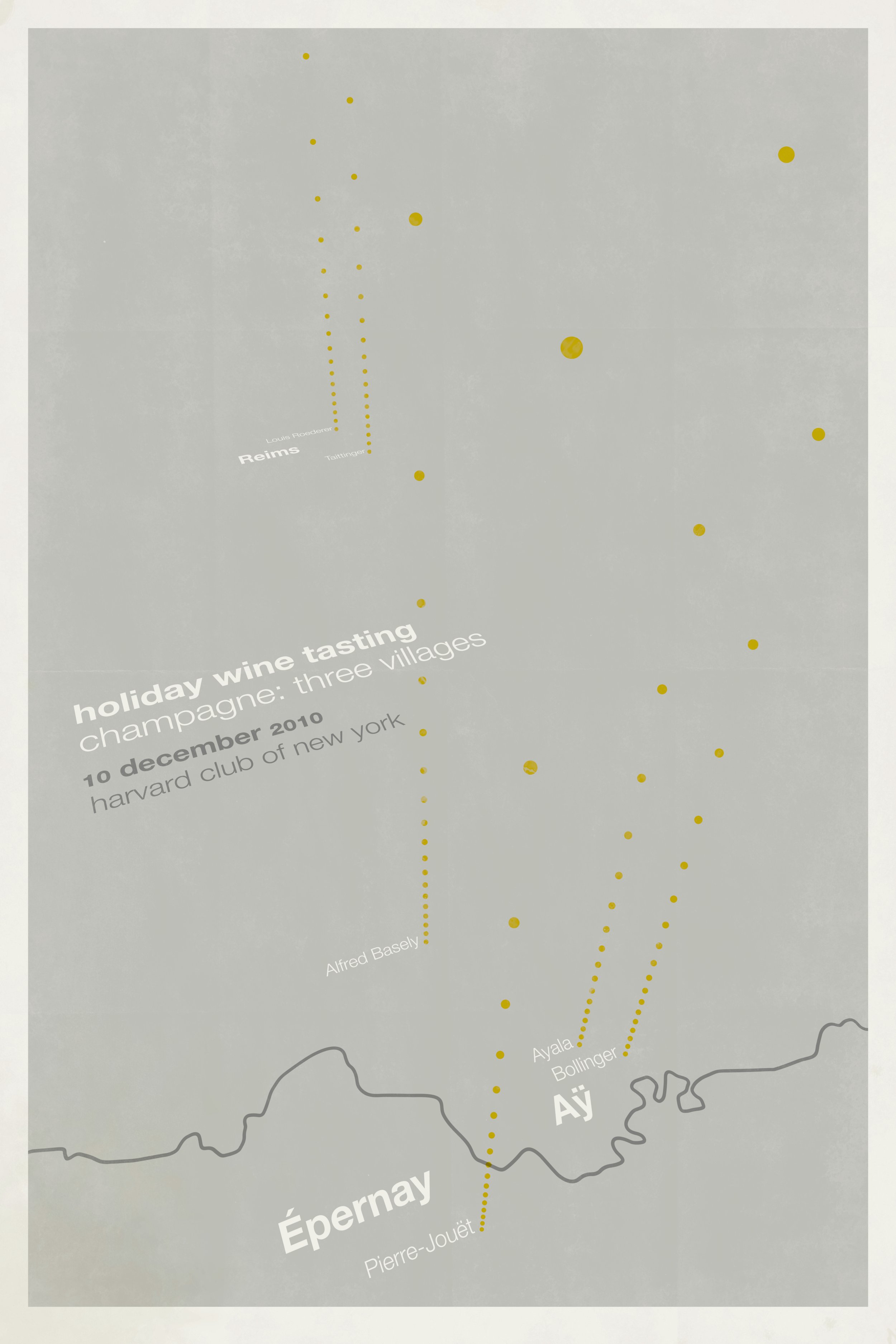
There’s nothing like a tight deadline to make apparent the benefits of an established design system. All of these designs were conceived as members within a family, and with the exception of the 2009 wine-tasting poster (which set the precedent for posters that followed), all of these designs stayed true to the colors, fonts, and graphic elements permitted within their respective series.
Two- and three-color posters. Printed 2008–2010. ¶ Harvard Club posters use a design system developed by H and are set in some not-very-good digitization of Helvetica. ¶ Syracuse Architecture posters use a design system developed by Michael Rock and 2×4 and are set in Venus, designed by URW.